The Art of Statistics
“The numbers have no way of speaking for themselves. We speak for them. We imbue them with meaning.”
Data visualization is at the heart of my work.
My love of research stems from my capstone thesis. I performed a statistical and sentiment analysis using .r code on found Twitter data.
I collected 10 thousand tweets featuring #BLM and #BlackLivesMatter each day during the first month of protests in the summer of 2020.
'My_Dataset(10,000_Tweets,30_Days)'
An incredible amount of information sharing by activists and derisive political discourse needed to be analyzed. As most of us were sequestered at home, the mass movement around George Floyd’s death and against police brutality was a reminder of our nation’s true penchant for community.
Our drive is to show, to rise up in a singular voice and cry change.
The findings of my thesis might not have been revolutionary (though I did, however, introduce my thesis advisor to the BTS stan community, as they were incredibly active on the #BLM and #BlackLivesMatter Twitter). My creative presentation of the facts earned me an “A”, accolades from my professors, and my current career as a one-person comms shop for a research think tank.
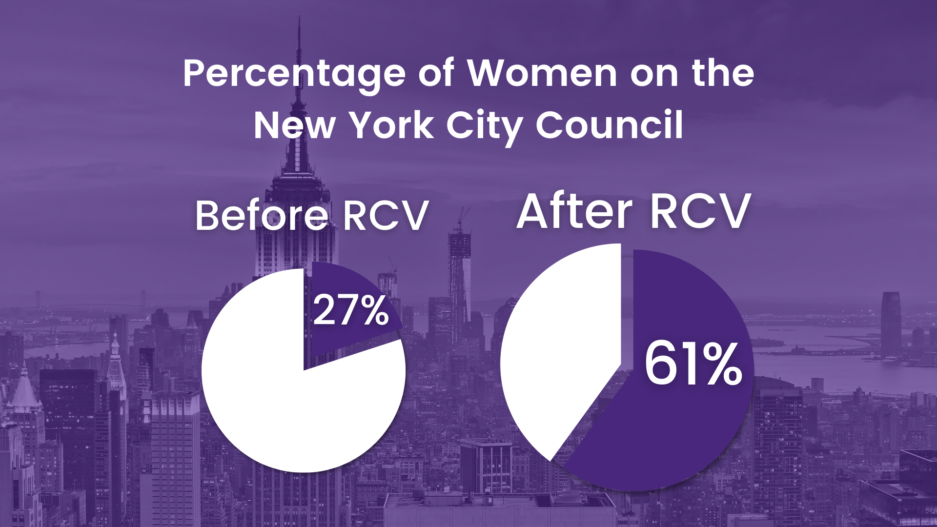
Below you can view my recent report designs and data-vis from various data sets about electoral reform and women’s political representation.